The idea: every width comes from a fixed procedure
After the cascade has picked a value for every property, the browser runs layout: it works out where each box goes and how big it is. For a box in a row this is plain arithmetic. The box model says what width measures. Flexbox and grid say how a container shares its width among its children. This page runs that arithmetic step by step on small examples, and every number on it is the number a real browser gives for the same CSS.
How the cascade picks the values is on The CSS Cascade. Where layout sits in the whole pipeline (DOM, style, layout, paint, composite) is on How a Browser Renders a Page.
The box model and box-sizing
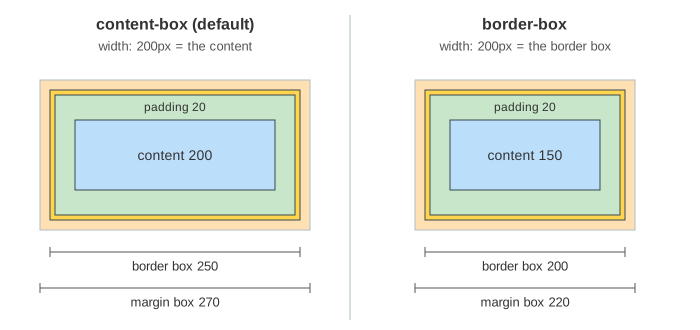
Every element is a box made of four layers: the content, then padding, then the border, then the margin. Padding and border are part of the box you see; margin is empty space outside it. The property box-sizing decides which layer width sets:
| CSS: width 200px, padding 20px, border 5px, margin 10px | content | border box | margin box |
|---|---|---|---|
box-sizing: content-box (the default) | 200 | 200 + 40 + 10 = 250 | 270 |
box-sizing: border-box | 200 − 10 − 40 = 150 | 200 | 220 |
Demo 1 grows the box ring by ring; Demo 2 starts from the 200px border box and takes the border and padding out of it. With content-box, two boxes of width: 50% and some padding no longer fit on one line. That is why many style sheets start with * { box-sizing: border-box }. Margin is never inside width.
Flexbox: basis, free space and flex-grow
A flex container (display: flex) lays its items along one main axis, here a row. The shorthand flex: 1 1 100px means flex-grow: 1, flex-shrink: 1, flex-basis: 100px. The browser resolves the widths like this:
- Every item starts at its flex-basis.
- Free space = container width − the sum of the bases.
- If it is positive, each item gets free space × its flex-grow ÷ the sum of all flex-grow. An item with
flex-grow: 0keeps its basis.
In Demo 3 the container is 600px and the items are A flex: 1 1 100px, B flex: 2 1 150px, C flex: 0 1 50px. Free space = 600 − 300 = 300. The grow factors add up to 3, so one unit is 100px: A gets 100, B gets 200 and C nothing. The widths are 200, 350 and 50. Note that B is not twice as wide as A: flex-grow shares the free space, not the whole width. For items that should end up equal, use flex: 1 1 0, so the whole width is free space.
flex-shrink: the overflow is weighted by basis
If the bases add up to more than the container, the free space is negative: the items overflow. Then they shrink, but not by flex-shrink alone. Each item's weight is flex-shrink × flex-basis, and each item gives back overflow × its weight ÷ the sum of the weights. A wide item gives back more than a narrow one with the same flex-shrink, so small items do not get squeezed to nothing first.
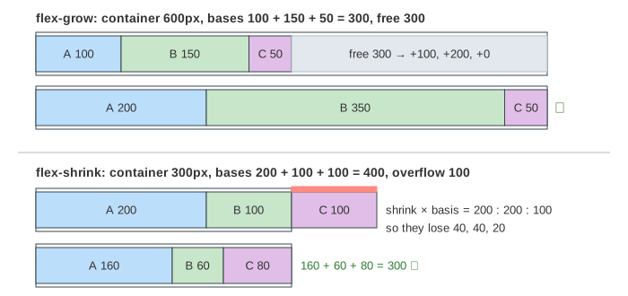
In Demo 4 the container is 300px and the bases are A 200, B 100, C 100, with flex-shrink 1, 2 and 1. The overflow is 400 − 300 = 100. The weights are 1 × 200 = 200, 2 × 100 = 200 and 1 × 100 = 100, together 500. So A and B each lose 100 × 200 ÷ 500 = 40 and C loses 20: the widths are 160, 60 and 80. B has twice A's flex-shrink and still loses only the same 40px, because A's basis is twice as big. Pick 480px with the width menu and press Lay Out: now there is free space, but every flex-grow is 0, so the items stay at their bases and 80px stay empty.
A real browser also stops an item from shrinking below its min-content size (min-width: auto): a long word or an image keeps the item wide. The items on this page are empty boxes, so that limit is 0 and never comes into play. When it does, the item is frozen at its minimum and the rest of the overflow is shared among the others.
Wrapping: each line on its own
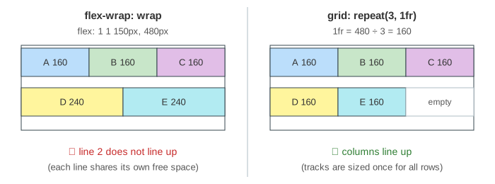
With flex-wrap: wrap, the browser first breaks the items into flex lines: a line takes items while their bases fit. Then it resolves each line as above, with that line's own free space. In Demo 5 five cards of flex: 1 1 150px sit in 480px. Line 1 takes A, B and C (450px); D would make 600px, so D starts line 2. Line 1 has 30px free, 10px each, so A, B and C are 160px. Line 2 has 480 − 300 = 180px free, 90px each, so D and E are 240px. The last line's cards are wider and do not line up with the cards above.
Grid tracks: fixed, auto and fr
A grid container (display: grid) works the other way round. It sizes the tracks (columns and rows) first and then puts each item in a cell, so items in the same column always have the same width. For columns:
| track | how it is sized |
|---|---|
120px (fixed) | always 120px |
auto | the width of its widest content; if no fr track takes the leftover, auto tracks share it |
1fr, 2fr (flexible) | leftover = container − the other tracks − the gaps; 1fr = leftover ÷ the sum of fr |
In Demo 6, grid-template-columns: 120px 1fr 2fr with column-gap: 30px in 600px: leftover = 600 − 120 − 2 × 30 = 420, the fr add up to 3, so 1fr = 140. The columns are 120, 140 and 280. In Demo 7, auto 1fr 1fr with 20px gaps: item A has width: 120px, so the auto column is 120, and the two fr columns get (600 − 120 − 40) ÷ 2 = 220 each. Unlike flex-grow, fr shares the space left after the other tracks, so 1fr 1fr columns are always equal.
Same cards, two layouts: when to use which
Demo 8 puts the same five cards in grid-template-columns: repeat(3, 1fr) at 480px. 1fr = 160, so all five cards are 160px. D and E sit in row 2 under A and B, and the third cell of row 2 stays empty. The columns line up; in Demo 5 they did not.
| flexbox | grid | |
|---|---|---|
| direction | one axis at a time (a row or a column) | two axes: rows and columns together |
| who decides the sizes | the items (basis, grow, shrink) | the container (track list) |
| after wrapping | each line is sized alone; columns do not line up | cells line up in every row |
| good for | toolbars, nav bars, a row of buttons, centring one thing | card galleries, forms with labels, page skeletons |
The two mix well: a page skeleton in grid, and a toolbar inside one of its cells in flexbox.
See also How a Browser Renders a Page: the layout step there is this arithmetic, run for every box, and a change to a width or a flex property triggers a reflow. And see The CSS Cascade for how each of the properties used here gets its value.
What the page leaves out
The column direction (flex-direction: column, rows in grid), gap in flexbox, auto margins, justify-content and align-items (where leftover space goes and how items line up across the axis), order, min-width / max-width clamps beyond the zero floor, min-content and max-content sizes of real text (the items here are empty boxes, and an fr track is really minmax(auto, 1fr)), minmax(), auto-fill and auto-fit, named areas, line placement and spanning, implicit tracks, subgrid, and percentages and rounding to device pixels.